Wizebank
How we designed a polished user experience for the e-learning analytics platform, Wizebank (and what we learned along the way).
Expertise
UX Research, Design
Platforms
iOS
Deliverables
UI, UX, Desktop, Web, Strategy, User Research
Interested
Capturing e-learning business insights in one easy to navigate space.
An analytics platform with seamless integration
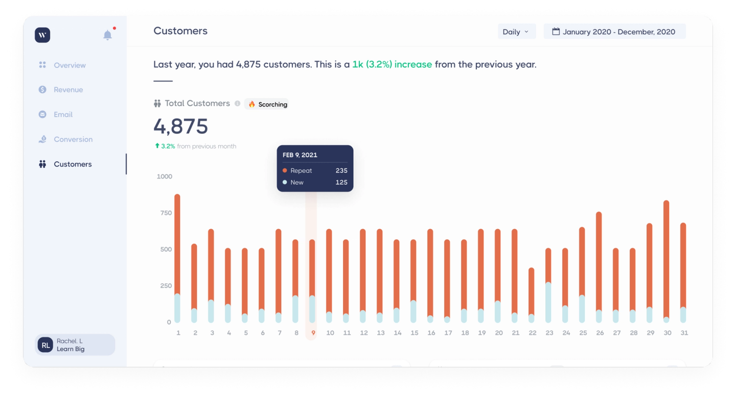
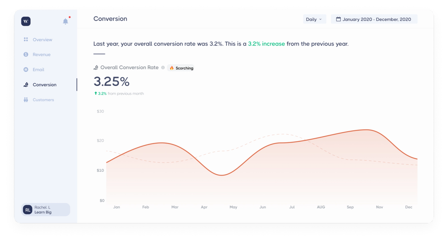
When we teamed up with Wizebank, they were looking for an analytics platform that seamlessly integrates with a user’s website, payments, and email marketing, while being easy to navigate with a user friendly dashboard. The crux was that Wizebank needed to build their MVP within a short time frame of 4 weeks, which can be an issue as a typical MVP takes at least 12 weeks to build.
However, they came to us with a pretty impressive design prototype, so we decided to adjust our design process to fit with what they had already created.
The Challenge
Steering from the process can put you off course
Wizebank arrived with an early prototype, but what they really needed was a partner to push the concept further, not just tidy the screens.
To meet their needs we ran a rapid discovery session with their team, and aligned on goals. Clear, direct feedback let us realign fast and deliver a re-imagined interface that went beyond polish and solved the bigger product problems.
Strong alignment builds great products
We asked Wizebank to write design principles and success statements to help us better understand what they really wanted us to build. Writing these are a key part of our onboarding so they were a great starting point when your usual process was reintroduced.
And it worked. Strong communication from both sides allowed Wizebank a deeper trust in our design process. We then expanded our initial scope, providing clarity on what to build and why. From there we were able to move from a second iteration wireframe to a near-ready UX design in just a week.


