FTSY

How we re-imagined the FTSY to create a more satisfying shoe shopping experience.

  • Expertise

    UX Research, UX Design, UI Design

  • Platforms

    iOS

  • Deliverables

    UI, UX, User Research

Improving the online shoe shopping experience

Before we begin

Our first priority was to gain a deep understanding of how potential FTSY users went about shopping for shoes online. We wanted to learn what worries them, what they like or dislike, and what makes a good shopping experience. We also needed to know how well the existing FTSY app performed.

To do this, we did 5 individual user testing sessions. During the interviews, we dug deep and figured out what each person’s vision of a great shopping experience looked liked and got each person to try the FTSY app. The thoughts and insights they shared were invaluable. We used the findings from these sessions as the foundation for our redesign.
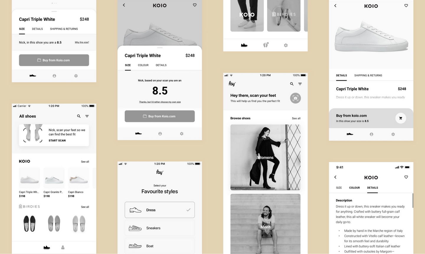
Mobile wireframesMobile wireframes

It’s in the details

Our testing sessions told us to focus on features that would help shoppers make a purchase more confidently. That meant concentrating on the product pages. We made the images larger so you could see every last detail, we showed the available colours and price more prominently, we made the product descriptions easier to find, and showed the sizing front and center.

We also changed the purchase button. Test participants described being surprised or hesitant to press the button in the original app because they were unsure of the next step. A color and copy change removed those worries.

The good part

5 out of 5 test participants told us over and over that they just wanted to get to the good part -- the shoes.

This meant redefining the structure of the app, and removing the cumbersome onboarding flow that caused so much confusion. We wanted people to freely browse all the unique shoes as quickly as possible so they could fall in love before they needed to scan their feet and enter any account details.

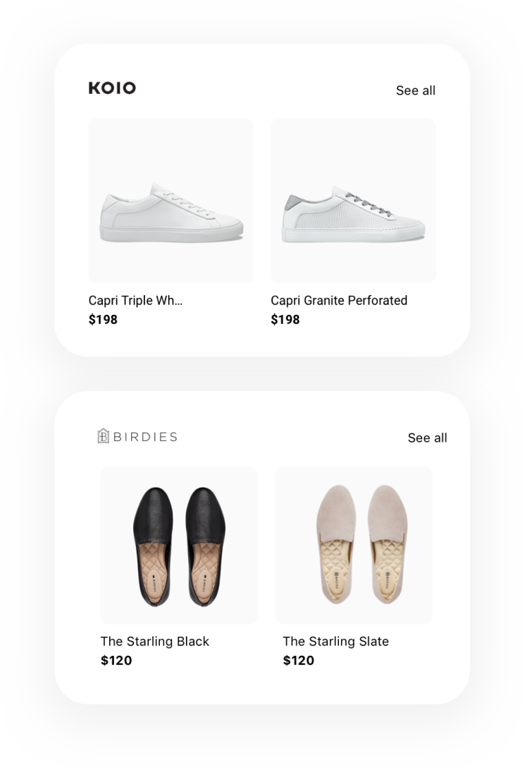
Shopping CardsShopping Cards
Scanning UIScanning UI
Mobile home pageMobile home page

The magic

FTSY’s scanning technology is the magic ingredient in the FTSY sauce. The scanner builds a super accurate 3D model by taking 24 photos of a shoppers feet guaranteeing any shoes you buy through FTSY fit perfectly.

While our participants loved the idea, they found it slow and difficult to get a successful scan.

We designed a scanning experience that is much faster and easier to use by focusing on giving shoppers clear instructions, a better sense of progress, and a clearer UI.

Scan on mobileScan on mobile

“Sixzero really impressed us with their ability to empathize with the consumer and the job they are trying to accomplish, including a little entertainment and fun. They took the time to imagine what an awesome outcome looks like.”

Ryan SmithRyan Smith

Ryan Smith

CEO, FTSY

Let’s work together

We will help you design something people love.

Contact Us