Perfect UI is pointless without great UX
Published

It’s common for startups to reference the giants like Apple or Airbnb when first looking for design inspiration. And why wouldn’t they? These well-known companies offer a perfectly polished experience for their users.
While these products are spotless in appearance, the reality is that it is not the look of the product that skyrockets an everyday device or booking site into a global phenomenon. These products add loads of value, presented in an easy-to-access solution that solves the main problem that their intended user has. That’s it. All an app needs to be a success is to have a user experience (UX) in which people find major value. The eye-catching user interface (UI) can always come later.
The most polished product can still have a terrible user experience
Imagine walking into the nicest restaurant in town. It’s clean, elegant, and the lights are dimmed just enough to secure an intimate mood. But after being seated, you end up waiting 30 minutes for your drinks, and when your food comes it tastes like crap.
Would you ever recommend this place, or better yet come back? Not likely.
But, have you lined up for an hour to get a taste of that mouth-watering taco that was made in the back of a greasy truck? In the end, if your product offers a positive, one-of-a-kind experience, a good enough interface will be just as successful as a spectacular one.
UX is the key to returning users
UX design is about providing users access to something they value in a way that makes sense to them. UI on the other hand provides the visuals that enhance the value that was created through building a great user experience. This is why UX should be your main focus when you’re building a product. A great experience will steer the core value of your product right to your users and when all else fails, it’s the value that is received that will ensure people come back for more.
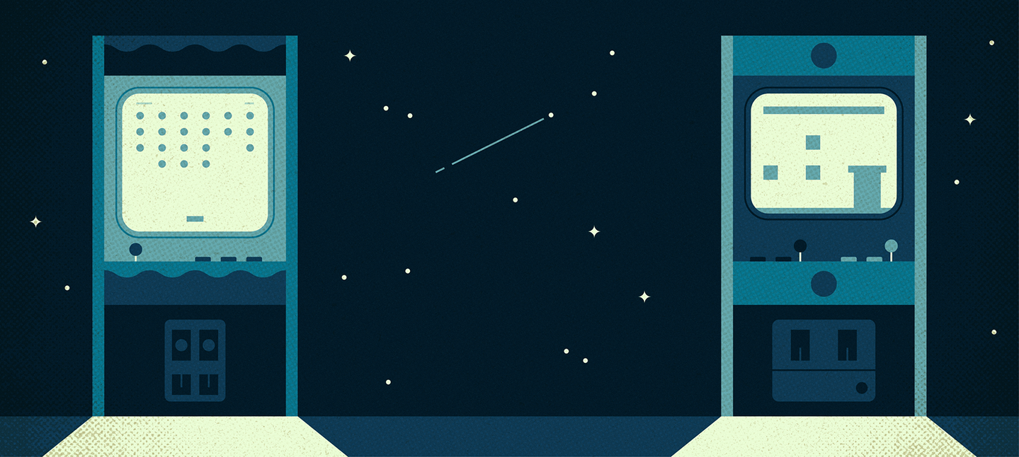
Just ask gamers who grew up during the growth of video games in the ‘90s and ‘00s. Chances are even after decades of development in gaming consoles, you’ll find many who still go back and play N64’s beloved Mario Cart. Perhaps it’s a bit of nostalgia, but it goes to show that it doesn’t matter how many state-of-the-art products are created in the future compared to how advanced your interface is; if your user has a positive experience using your product, they’ll likely be back for more.
So if you’re creating your first product, don’t worry about it looking remarkably innovative. Your UI just needs to be good enough that it doesn’t actively discount the positive experience that the product provides.
Take a look at the popular advertising giant, Craigslist. At first glance, Craigslist looks like it’s stuck in the ’90s. However, it’s the very bare-bones, no gimmicks experience that Craigslist presents that has instilled long-time trust and reliability with its users – ultimately solidifying the popularity of the site well into the new millennium.
Cha-Ching.
How to know when your product is good enough
A minimum viable product (MVP) is a product that has just enough features to accomplish what it’s supposed to do. But how do you know when your MVP is “good enough” and how do you overcome the fear that you’ve missed something?
The best place to start is by defining what success looks like before you even start designing. This can be as simple as writing a success statement that outlines your team’s collective vision of a project win. Once your product is complete, revisit this statement and ensure that your indicators of success have been met.
From there, answer these few questions:
- Does the product solve the problem that the intended user is having?
- Has it been through thorough user testing?
- Has all feedback been accounted for and incorporated as needed?
- Is the quality of work consistent with previous work?
- Is the overall experience of using the product on brand?
If your product meets your criteria for success and you’ve answered yes to the above checkpoints, it’s likely safe to say your MVP is good enough to ship.
The Takeaway
Users won’t care about your pixel-perfect app if they don’t find value in its functionality. If you spend too much time trying to perfect your UI early on, you’re taking away valuable resources from creating a great UX. And that’s what makes your app truly valuable to users. The delight that a great UI is always something you can add on later. After all, the most beautiful software you see today started from humble beginnings. And lest we forget, some of those tech giants out there have done just fine by staying humble.
If you're still curious about UX strategy, check out this helpful guide from Design Rush.
Nick Foster is the founder of Sixzero, an agency that helps companies design apps and software with impact.
Illustration by: Muti, Folio Art